
Email Signature Tips & Examples
While the email subject and content is the main focus of any email, it is also important to note that at the end of an email is where an email signature is usually found and is where the receiver of the email will get an insight as to who the sender is and how to connect with said sender outside of the email. It gives the receiver a sense that the email is official and that the sender is a professional.
So, with that said, here are some tips we’ve gathered to make your email signatures pop!
Avoid using too many different fonts
While it’s true that using different fonts will enable you to highlight certain important information, your email signature will only look cluttered and will lose the professional feel to it. A good way to go around this, but still make sure that certain information is highlighted is to choose a font style that has a flexible typeface and will enable you to choose from different versions but still use the same font style.
Aside from flexible typeface, you can also play around with font colour and font size to make sure that information you want to highlight will definitely pop and catch attention. Consider the example below:

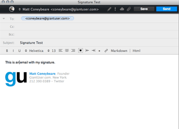
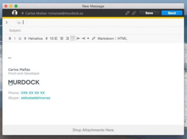
Of course this is not an absolute limitation. You are free to use more than one font type in your email signature. If you do decide to do so, consider using only one type and use one that is cohesive and to your other font type. Consider the example below, the fonts used in this signature is serif and sans serif.

Keep it simple
What this means is that you want to make sure that the graphic elements in your email signature is simple and not cluttering the signature itself. Remember that it is only a signature and not an infographic.

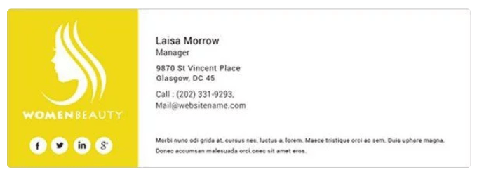
Keep it simple by including your company logo or your professional photo, usually a headshot like the sample below.
Use social media icons
Another key element to add to your email signature are social media icons linking to your social accounts. This will give the email receivers a sense that they are communicating with an actual person and not just receiving an automated message.

Another tip is to search and use icons with design and colour that complement your overall email siggy design. It can be the standard colours of said logos, or use versions with a pop of colour, or black and white versions. The choice is up to you.
Use dividers
Using dividers will give a feel that is neat and organised to your email signature. It will also be easier for your email receivers to sort out key information in your siggy by segmenting the information.
Whether you use graphic dividers to add design or glyph dividers to keep it simple, be sure that they align to your overall design.
Make sure your email signature is mobile friendly
Take note that most users tend to use mobiles to access their emails. Consider this detail when creating your email signature and make sure that it is mobile friendly and responsive. Make sure your graphics and images can be scaled down to fit different device types and screen sizes.
Align your email signature design
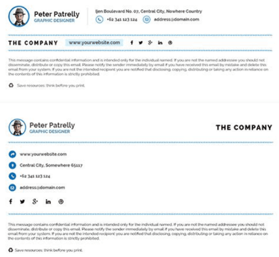
Another way to make your email siggy neat and organised is to align the graphic elements, text and icons. Also, because it is easier to navigate and locate certain elements starting from the left side, make sure you align your email signature on the left.
Don’t clutter your email signature with too much information
Stick to the basics. What should your email signature really include? Consider the following elements:
- Company Logo
- Your Name
- Your Company Name
- Your Position
- Phone
From here, you can decide whether you want to add more details such as your social media accounts, subscribe buttons, etc.
Avoid using too many colours
This is not to say that you are not allowed to use different colours on your email signature. There are some designs that benefit with colour, afterall. Unless your email signature design calls for it, you should avoid adding a lot of colours to your palette. Try basing your colour palette according to your company logo or the overall colour palette of your company.
Consider the following examples:
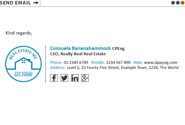
Notice how there is only one pop of colour to this email signature following the logo’s overall colour theme.
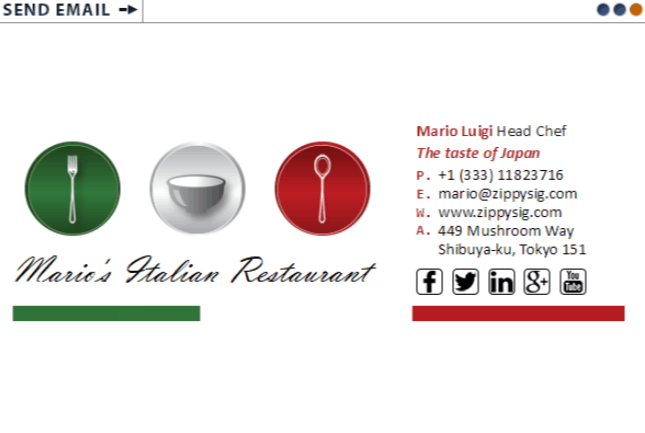
The colours used here emulate those of the Italian flag. This makes sense because the restaurant is of the Italian variety.
Use information heirarchy to determine order and where to place information
Determine what key information you want to highlight and what to put first in your email signature. Of course, the very first choice should be YOUR name since you are the sender. The next should be your company, position in the company and then other credentials if possible.

Notice how the prominence of each element is taken into consideration by making use of font size, typeface and font colour.
If you want to know more how to design a professional-looking email signature, drop us a line and we will be more than glad to help you.
About SiteSpot
SiteSpot is a website management system that makes writing, designing and maintaining your site a breeze.